|
|
| |
|
| |
|
| |
|
| |
|
| |
|
| |
|
| |
|
| |
|
| |
|
| |
|
| |
|
| |
|
| |
|
| |
|
SYSTAT : SIGMASCAN : TableCurve2D : TableCurve3D : PeakFIT : AutoSignal |
NEW FEATURES |
|---|
SigmaPlot 12 has Twelve Exciting New Features! |
The improved customizable GDI+ graphics software support provides enhanced graphics features:
Anti-aliasing minimizes jagged lines. This provides a much more professional look on the computer monitor. The graphs below show antialiasing in use on the left but not on the right.
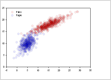
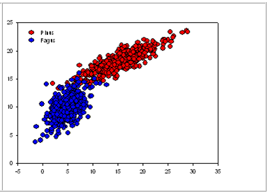
Area objects may be made transparent with the user setting the degree of transparency. Also, areas with color gradients have two controls for both the initial and final color transparencies. As shown below, transparent symbols can be used to show the “mass” of overlapping objects. Also, transparency can be used to show results that lie behind other results. In the graphs below, compare the transparent symbols on the left to the non-transparent on the right to see the histogram “mass” effect of overlapping symbols.
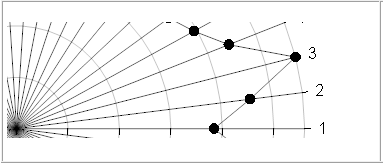
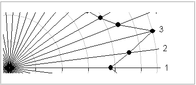
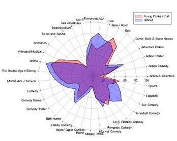
Radar Graph The radar graph allows plotting and comparison of multiple variables beyond the two or three previously allowed in SigmaPlot. It is not unusual to graph 5 to 20 variables in a radar graph – 35 are shown in the graph below. A new data format was created to allow input of the variable names in a worksheet column. There are six radar subtypes for almost any application: scatter, line, line & scatter, vector, area, line & error band. Two area radar plots of 35 variables are shown below. The areas are transparent (new transparency feature) in order to show all variable values for both plots.
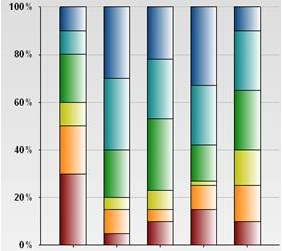
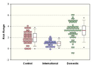
The dot density graph is a graphical arrangement of data points which is designed to display the density of data. Data is graphed vertically or horizontally as histograms with data points displaced to prevent overlap. Plots look like they have been prepared by an artist with data points either touching or nestled together. Points may be displaced from one another or overlapped to create a grape-bunch effect. SigmaPlot's implementation allows the comparison of multiple dot density plots with additional descriptive plots that include mean lines, median lines, box plots and percentile lines. The graph below shows three dot density plots each with their associated box plot.
(11) Application Support Features |
SIGMAPLOT RESOURCES : Upgrade Comparison : SigmaPlot REVIEWS : SigmaPlot Supports : SigmaPlot FAQ : Technical Graphing Workshop |