|
Course Description
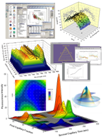
This training offers the participants on how to visualize, analyze and communicate data using software tools like SigmaPlot! It will assist the participants to present your finding accurately using precise, publication quality graph, data analysis and presentation tools. Starting with enables you to quickly plot all your data exactly the way you want. Analyze and explore complex datasets, arrange multiple XY, 2-and 3-D plots, and then communicate your results. The participants are able to achieve their goals using the SigmaPlot environment and can create many different chart types as well as templates.
DURATION
1 Day
Course Benefits:
All features are covered with instructor directed examples or exercises. Major features are emphasized with student exercises.
At the end of the course Participants will learn what SigmaPlot can do for you and will achieve the following benefits:
· Publication-quality graphs
· Beyond spreadsheets Plotting
· Makes data visualization easy
· Publish your charts and graphs anywhere
Course Outline:
Setting the Foundation
- The Notebook Manager basics—the basic SigmaPlot File with its multiple sections, worksheet, and reports
- Handling data—methods for importing data, linking to Excel, filtering and arranging rows and columns, setting up worksheets with replicates and custom data series
- Getting Familiar wth the operating environement : Overview of menus, toolbars, worksheets and default settings—a quick tour of the most common toolbar items; manipulating data within the worksheet and setting user defined preferences and defaults
- Graph Wizard—Choosing the right graph types—simple XY scatter plots, line graphs, box plots, three dimensional graphs and others
Graphing Techniques
- Axis breaks—creating multiple X or Y axes
- Formatting the datasets; changing the settings for the symbols, lines, fills, etc.—creating custom color and pattern schemes with graphic cells
- Working with axis settings; adding more axes—reference lines and custom axes
- Creating PowerPoint presentations and placing graphs into Word documents
- Creating a gallery of graph style templates
- Arranging multiple graphs and objects on the page layout
- Using Macros and automation techniques
Statistical analysis of data
- An overview of the terms used in analyzing data such as significance, normality, error, and confidence.
- Checking data for normality or symmetry—looking at the distribution of the data with histograms and box plots.
- Descriptive statistics—a look at the basic statistics such as mean, median, standard deviation, standard error, confidence, coefficient of variation and how they are related.
- Performing comparison tests with paired datasets and repeated measures
Regression analysis and Data Manipulation
- Searching for trends—linear regression and how it compares to correlation
- Fitting data to known models—looking at the most common nonlinear methods; comparing models; comparing best fit parameters from datasets; constraining parameters.
- Data manipulation—transforming and normalizing data
- Simulating data and creating theoretical curves with the "Plot Equation" feature
- Creating standard curves to derive unknown X and Y values
Who Should Attend:
This workshop will benefit researchers, scientists, engineers or anyone who would like to look for the simplest way to analyze and graph research data and create your exact technical graph and publish your work anywhere.
|