Click here to see the online version.
 |
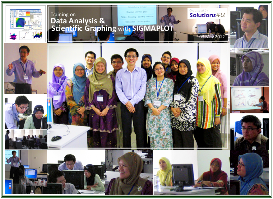
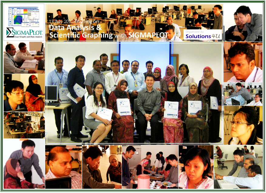
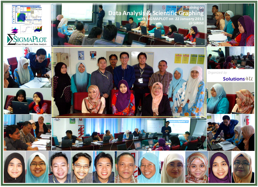
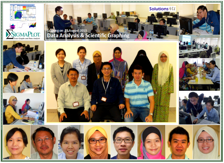
Training on Data Analysis & Scientific Graphing with SigmaPlot Solutions 4U Training Center @ Puchong , Malaysia |
||||||
 |
 |
 |
 |
 |
 |
 |
|
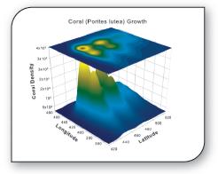
how do you get meaningful information out of it all? "
When you set out to climb that data mountain, you need something to guide you up the best route. And when you reach the top, your reward should be an outstanding view - a view that reveals the trends, the anomalies and the physics that give you a real understanding of what your data means. |
 |
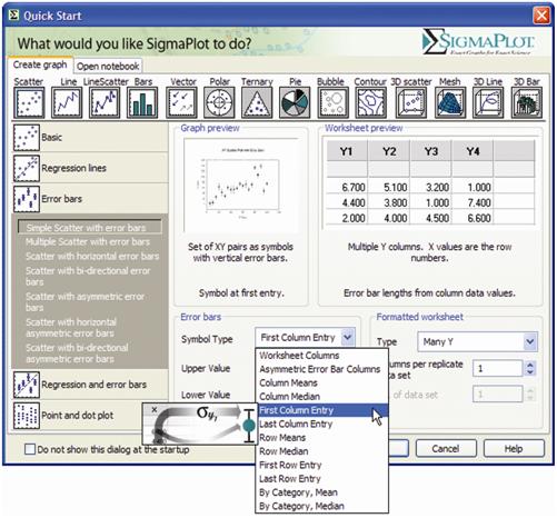 |
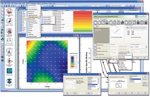
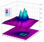
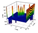
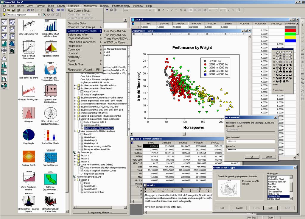
This 1-days hands-on training is designed to provide a comprehensive understanding of one of the contemporary package for scientific graphing and data analysis. This platform will take you beyond simple spreadsheets to help you show off your work clearly and precisely. You could produce high-quality graphs without spending hours in front of a computer and it offers seamless Microsoft Office integration, so you can easily access data from Microsoft Excel spreadsheets and present your results in Microsoft PowerPoint® presentations. This platform also provide various intuitive interface and wizard technology that leads you through every step of graph creation. You get compelling, publication-quality charts and graphs in no time. The package offers more options for charting, modeling and graphing your technical data. |
All features are covered with instructor directed examples or exercises while major features are emphasized with participant hands-on exercises. At the end of the course, participants will achieve the following benefits:
• Create compelling graphs for publications, presentations and reports.
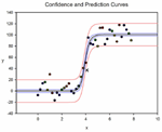
• Fit data easily and accurately with the Regression Wizard, Dynamic Fit Wizard and Global Fit Wizard.
• Analyze data confidently and visualize results easily with expert guidance.
Course Outline
Setting the Foundation
- The Notebook Manager basics — the basic SigmaPlot File with its multiple sections, worksheet, and reports
- Handling data—methods for importing data, linking to Excel, filtering and arranging rows and columns, setting up worksheets with replicates and custom data series.
- Getting Familiar with the operating environment : Overview of menus, toolbars, worksheets and default settings—a quick tour of the most common toolbar items; manipulating data within the worksheet and setting user defined preferences and defaults
- Graph Wizard—Choosing the right graph types—simple XY scatter plots, line graphs, box plots, three dimensional graphs and others.
Graphing Techniques
- Axis breaks—creating multiple X or Y axes.
- Formatting the datasets; changing the settings for the symbols, lines, fills, etc.—creating custom color and pattern schemes with graphic cells.
- Working with axis settings; adding more axes—reference lines and custom axes.
- Creating PowerPoint presentations and placing graphs into Word documents.
- Creating a gallery of graph style templates.
- Arranging multiple graphs and objects on the page layout.
- Using Macros and automation techniques
Statistical Analysis of Data
- An overview of the terms used in analyzing data such as significance, normality, error, and confidence.
- Checking data for normality or symmetry—looking at the distribution of the data with histograms and box plots.
- Descriptive statistics—a look at the basic statistics such as mean, median, standard deviation, standard error, confidence, coefficient of variation and how they are related.
- Performing comparison tests with paired datasets and repeated measures.
Regression Analysis and Data Manipulation
- Searching for trends - linear regression and how it compares to correlations
- Fitting data to know models - looking at the most common non-linear methods; comparing models, comparing best fit parameters from datasets; constraining parameters.
- Data manipulation - transforming and normalizing data.
- Simulating data and creating theoretical curves with the "Plot Equation"
- Creating standard curves to derive unknown X and Y values.
Who Should Attend
The course combines theoretical studies and practical workshops, ensuring that each participant gets individual focus, and understands scientific data analysis and technical graphing. It is intended for researchers, scientists, engineers, data analysts or simply anyone involved in working or likely to work with numbers or data to obtain information, graphical visualization and statistical understanding.
Note: Due to the nature of the course and the learning expectations, the availability seats are limited. You need to register early to obtain confirmation of your space.
Sign Up Now!
Fees : RM 950.00 Only
10% Early Registration Discount
10% Concurrent Group of 3 Pax
For more information on SigmaPlot product and Solutions, please contact us at enquiry@solutions4u-asia.com
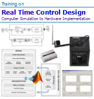
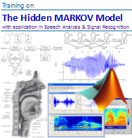
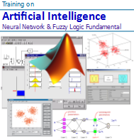
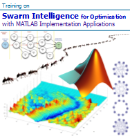
Other upcoming courses to enrich and enhance your technical computing capability and data anaysls skill-set, Just click onto the Title to find out more details.
 |
 |
 |
 |
 |
 |
 |
 |
 |
 |
 |
 |
![]() :
:
The updates of our training program are sent to you, as we think that they might be of interest and benefit you. Please help to forward to others who may be interested. However, you may unsubscribe if you do not wish to receive further mailing from us. Thank you.